Understanding How Tableau Thinks: Discrete vs. Continuous Data

This week I’m doing my very first Tableau training session. In explaining how Tableau works, or how it thinks, which is important for really leveraging the power of the program, one must understand, the difference between the blue and the green pills. This blog is also taken from my data school days and will be very much like Tom Brown’s blog post, but here goes my interpretation…
When you look at your Tableau Desktop window, you will notice that your data has been split into ‘fields’ and sit in either a ‘dimensions’, ie. what you are measuring, or ‘measures’ ie. the measurement that was made, shelf, in the data pane to the left. These fields are either blue or green and when brought into the chart building view, they are called pills (because they look like pills) and retain their blue or green colour.
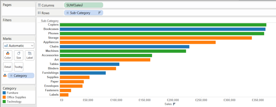
The colours actually represent the type of data in the field. The blue pills contain discrete data, and the green pills contain continuous data. The blue discrete field contains a finite number of values, so in the example there are only a finite number of product categories. The green continuous fields contain an infinite number of values ie. the number of sales could be infinite.
A field being discrete or continuous, impacts every aspect of functionality in the analysis, from the way the data is displayed, to the behind the scenes processing of the data and understanding how this differs is essential to understanding how Tableau works. I’ll explain these differences below, using the Superstore Sales Sample data that you get with Tableau Desktop. I will use them in columns and rows to build a chart, in filters to streamline data and in colour, to add levels of detail or highlights to your presentation.
- Columns and rows

- When a discrete field is added to a column or row, it will be displayed as a ‘header’, something that is used to divide your data.
- If you do the same with a continuous field, an axis is drawn which will give you an aggregation of the field you have selected for the entire data set. For examples, if you are looking at the Superstore Sales example data set, provided by Tableau, and you have put sum of ‘sales’ on the column or row shelf, you will be given the sum of all the sales in the entire data set ie. over x amount of years, for x amount of product types, in one column or row, respectively.
- Now by using both, you bring in your continuous data, and can start breaking this down by the categories set by the discrete data, for example, breaking down the sum of sales, by the year or (sub)category of items sold.
Pro tip: You can sort your data really easily by pressing the little button on the axis you want to sort by.
Knowing this, you can make almost any variation of chart in tableau. Bringing multiple discrete fields into the view, gives you a nested division of the discrete fields. For example if you bring in category and subcategory.

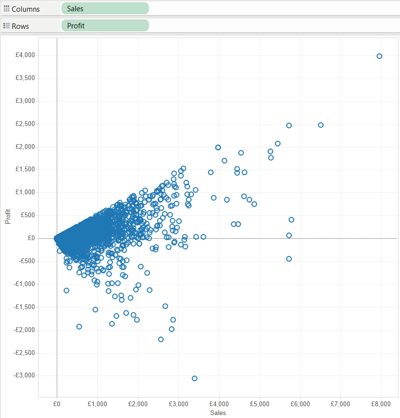
Bringing in more than one continuous field, gives multiple axes for the same discrete fields. For example if I bring in both sales and profit for my product category, I will now essentially have to mini graphs.

You can make a scatter plot, by plotting two continuous fields against each other, making two axes.
Alternatively you can make a table, by placing your discrete fields on the columns and shelves to create headers and placing a continuous field on the details on the marks card to flesh the table out.

- Filters
What happens when you put discrete fields and continuous fields on filters, again, really shows what the difference between discrete and continuous data is.
- Placing a discrete field on filters will bring up a dialog box, which allows you to choose ‘members’ of the discrete fields.
- When placing a continuous field on the filter shelf, you first have to give an indication of whether or not you want your data aggregated and if so, how. You are then prompted to select a range from your continuous data.
- Colour
Once you have created a chart, you can use colour to show another layer of information.
- A discrete field will essentially put a grouping on by colouring members of that group, or break down a bar into subcategories, depending on what granularity you colour by. In the example, of sales by subcategory, if you bring category to the colours shelf, all subcategories within one category will be given one colour.
- Bringing a continuous field to the colours shelf, will give you a divergent colour scale for that particular field. For example, if you were to bring profit to the same view, you then get the sales bars coloured by a profit scale, with the least profitable in red and the most profitable in green. These colours can of course be changed!

Hopefully that has cleared up the distinction between the blue and the green things in Tableau!